Thoai
Thoai1. Introduction
Angular Material, initially named AngularJS Material, began as an open-source project developed by the Angular team at Google. The project aimed to bring the principles of Material Design into AngularJS applications. It provided a set of reusable UI components that aligned with the Material Design guidelines, allowing developers to create consistent and visually appealing interfaces.
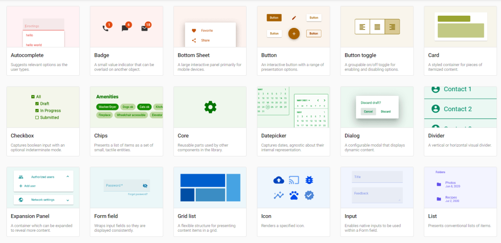
There are a lot of stunning components supported by Angular Material, you can access Angular Material’s official website to learn more about them.
In this topic, we will create a sample Angular 17 application and then add Material design to this application to see how it works. Let’s start!
2. Setup a sample application
We will NX to create a sample application via the below command:
npx create-nx-workspaceI use NX standalone application to simplify the project but you can specify any configuration you want:
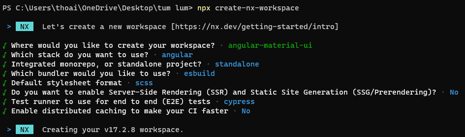
Then, we need to enable Angular Material
cd angular-material-ui
npm install -D @angular/material
npx nx g @angular/material:ng-add
The project structure will be like below.
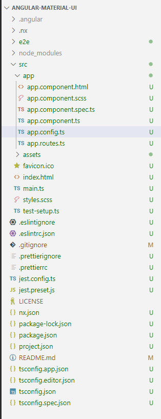
Note that we have to include provideAnimations in app.config.ts to complete the setup. Normally, this step will be done automatically inside the npx nx g @angular/material:ng-add command but if it doesn’t you need to add it manually.
app.config.ts
import { ApplicationConfig } from '@angular/core';
import { provideRouter } from '@angular/router';
import { appRoutes } from './app.routes';
import { provideAnimations } from '@angular/platform-browser/animations';

export const appConfig: ApplicationConfig = {
  providers: [provideRouter(appRoutes), provideAnimations()],
};
3. Add some Material components
Now, we can add any Material component to our application. I will add some Material buttons with icons to our application. To use a Material component, we need to import its module to the component.ts field. For example, to use Divier, Button, and Icon components, we must import MatButtonModule, MatDividerModule, and MatIconModule correspondingly.
app.component.ts
import { Component } from '@angular/core';
import { RouterModule } from '@angular/router';
import { MatButtonModule } from '@angular/material/button';
import {MatDividerModule} from '@angular/material/divider';
import {MatIconModule} from '@angular/material/icon';

@Component({
  standalone: true,
  imports: [MatIconModule,RouterModule,MatButtonModule,MatDividerModule],
  selector: 'angular-material-ui-root',
  templateUrl: './app.component.html',
  styleUrl: './app.component.scss',
})
export class AppComponent {}
app.component.html
<section>
  <div class="example-label">Basic</div>
  <div class="example-button-row">
    <button mat-button>Basic</button>
    <button mat-button color="primary">Primary</button>
    <button mat-button color="accent">Accent</button>
    <button mat-button color="warn">Warn</button>
    <button mat-button disabled>Disabled</button>
    <a mat-button href="https://www.google.com/" target="_blank">Link</a>
  </div>
</section>
<mat-divider></mat-divider>
<section>
  <div class="example-label">Raised</div>
  <div class="example-button-row">
    <button mat-raised-button>Basic</button>
    <button mat-raised-button color="primary">Primary</button>
    <button mat-raised-button color="accent">Accent</button>
    <button mat-raised-button color="warn">Warn</button>
    <button mat-raised-button disabled>Disabled</button>
    <a mat-raised-button href="https://www.google.com/" target="_blank">Link</a>
  </div>
</section>
<mat-divider></mat-divider>
<section>
  <div class="example-label">Mini FAB</div>
  <div class="example-button-row">
    <div class="example-flex-container">
      <div class="example-button-container">
        <button mat-mini-fab color="primary" aria-label="Example icon button with a menu icon">
          <mat-icon>menu</mat-icon>
        </button>
      </div>
      <div class="example-button-container">
        <button mat-mini-fab color="accent" aria-label="Example icon button with a plus one icon">
          <mat-icon>plus_one</mat-icon>
        </button>
      </div>
      <div class="example-button-container">
        <button mat-mini-fab color="warn" aria-label="Example icon button with a filter list icon">
          <mat-icon>filter_list</mat-icon>
        </button>
      </div>
      <div class="example-button-container">
        <button mat-mini-fab disabled aria-label="Example icon button with a home icon">
          <mat-icon>home</mat-icon>
        </button>
      </div>
    </div>
  </div>
</section>
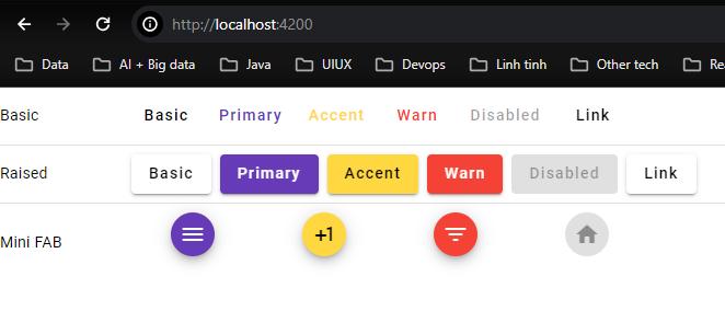
Let’s access our application, you will see some stunning Google Material buttons and Icon.
5. Conclusion
Implementing Google Material Design in Angular offers numerous advantages. It provides a comprehensive set of guidelines, components, and tools that enhance the visual appeal and functionality of web applications. By leveraging Material Design principles within Angular, developers can create consistent, responsive, and intuitive user interfaces. This combination streamlines development, as Angular’s robust framework integrates seamlessly with Material Design components, allowing for efficient implementation and customization.
Furthermore, Material Design’s focus on user experience promotes accessibility and usability across various devices and platforms. The pre-built components, animations, and theming capabilities simplify the development process while ensuring a cohesive design language. Ultimately, utilizing Google Material Design in Angular empowers developers to build sophisticated and visually appealing web applications that adhere to modern design standards, enhance user engagement, and deliver an intuitive user experience. This sample project can be found on GitHub.